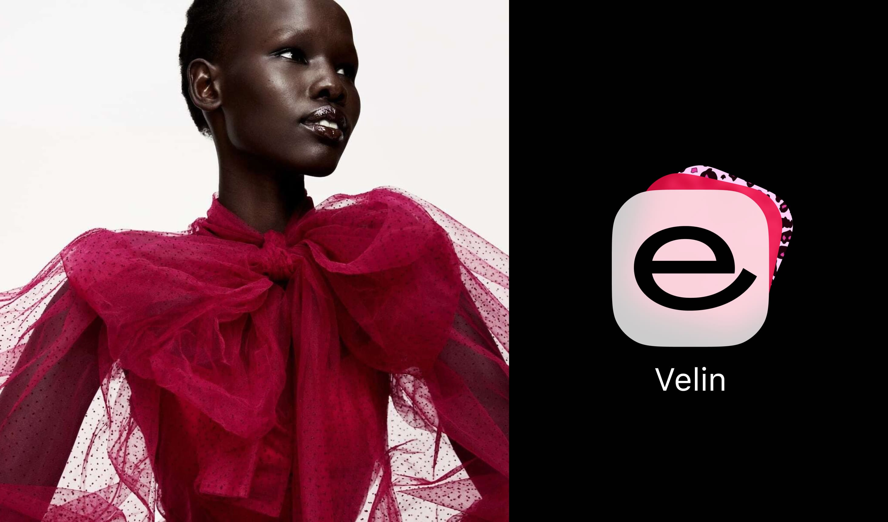
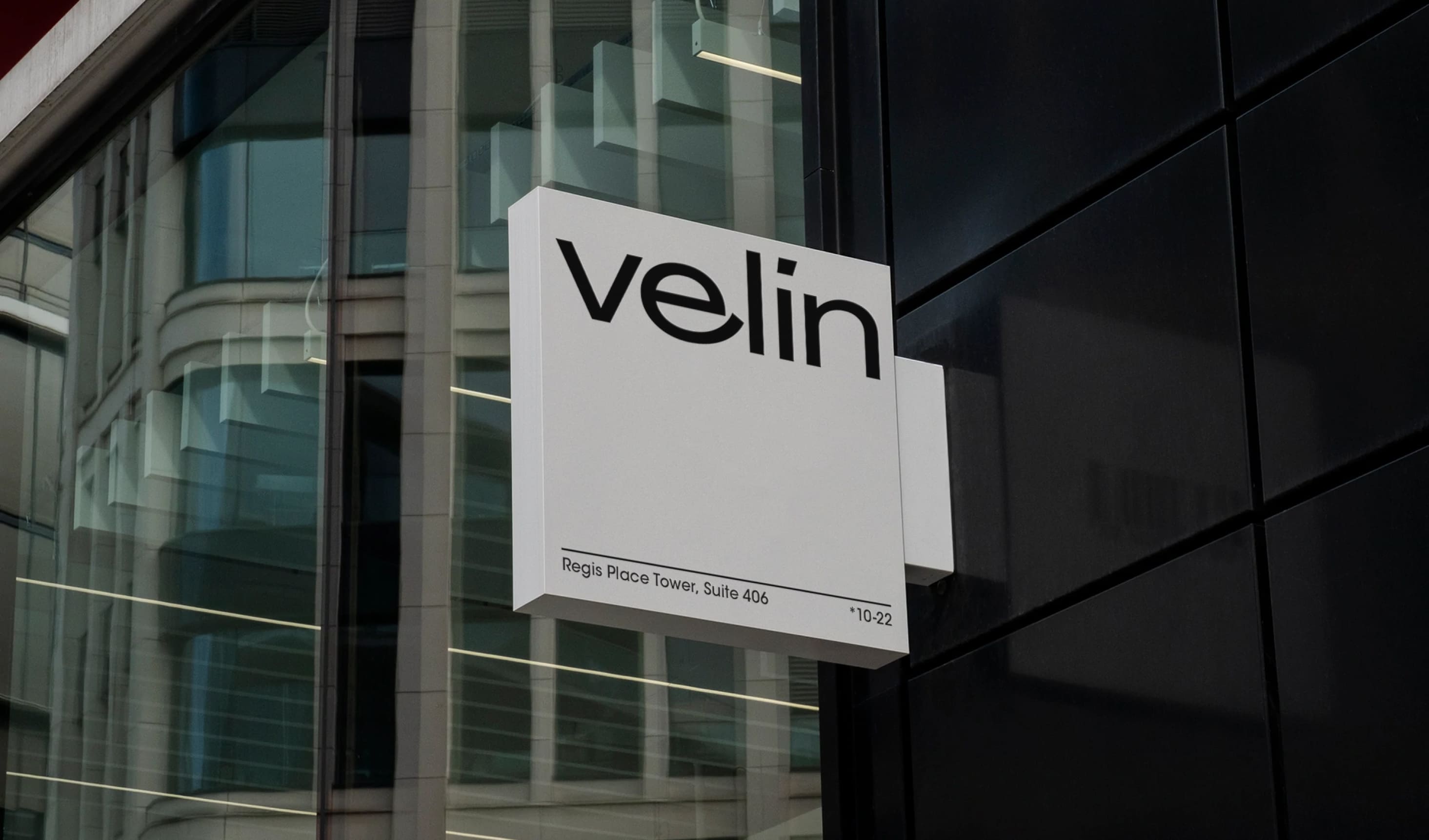
Кроме логотипа и шрифта мы разработали для Velin и другие элементы фирменного стиля, включая лаконичную цветовую схему и подбор подходящей шрифтовой пары для сайта.
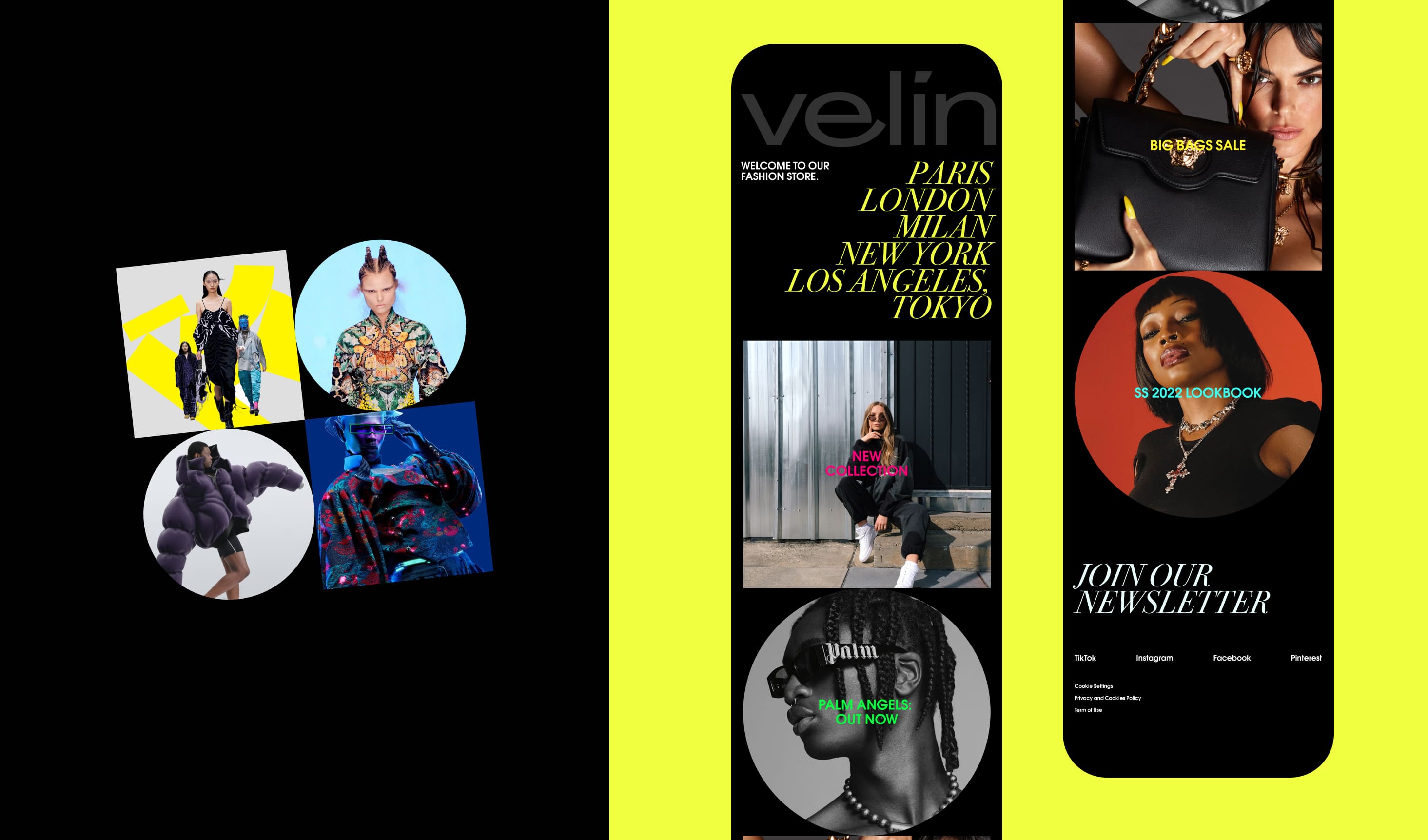
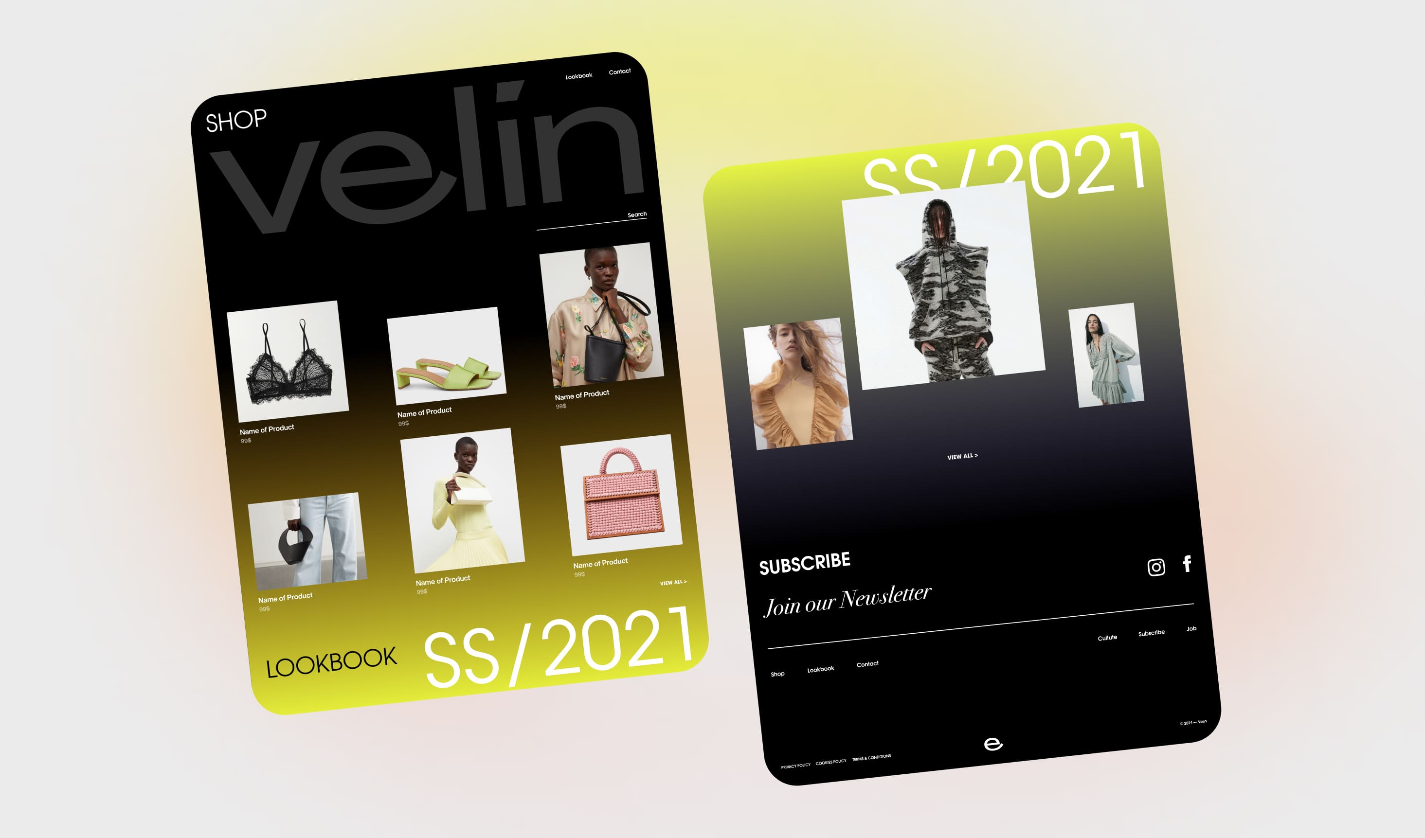
Гайдбук, который мы оформили для клиента, ориентирован на цифровые форматы и, помимо прочего, включает дизайн-концепцию сайта бренда.
При её создании, как и при работе над фирменным стилем Velin, мы придерживались минималистичного подхода. Простой и понятный, не перегруженный деталями интерфейс, мягкая цветовая гамма с градиентом — нашей задачей был дизайн онлайн-пространства, которое функционально служит своеобразным паспарту для фотографий из лукбуков модных брендов, и при этом эмоционально воспринимается как самостоятельная фешн-площадка.